'a high price for emotional labour';subtle and covert modification; under the representational demands; playing 'tour-guide' for others; navigating the objects, interests and values that made up 'home'; the devolution of our shared life and an opening out to change and flux; oscillation between private and public, ontological meaning and representational meaning; “we love playing host and welcoming guests into our home”; the desire to go backstage, to penetrate the heart of their host’s everyday life; “before long we were feeling very at home”; something was eating away at the 'staycation' dream; a hub of transient sociality; “we hadn't realised that we shared the bathroom with the hosts”; “records, bands and DJs are an important part of our life”; “we spent some quality time with Bev who was kind enough to mix some '80s music for us”; mutability was key to our success; “Bev's paintings are all over the place and give it a very personal feeling”; emotional selling point; the fallout of aesthetic rhetoric; art becomes commerce, place becomes space, home becomes homelessness; staged authenticity concealed the essence of human sadness...
Showing posts with label mundane. Show all posts
Saturday, 31 January 2015
Living Under the Tourist Gaze
'a high price for emotional labour';subtle and covert modification; under the representational demands; playing 'tour-guide' for others; navigating the objects, interests and values that made up 'home'; the devolution of our shared life and an opening out to change and flux; oscillation between private and public, ontological meaning and representational meaning; “we love playing host and welcoming guests into our home”; the desire to go backstage, to penetrate the heart of their host’s everyday life; “before long we were feeling very at home”; something was eating away at the 'staycation' dream; a hub of transient sociality; “we hadn't realised that we shared the bathroom with the hosts”; “records, bands and DJs are an important part of our life”; “we spent some quality time with Bev who was kind enough to mix some '80s music for us”; mutability was key to our success; “Bev's paintings are all over the place and give it a very personal feeling”; emotional selling point; the fallout of aesthetic rhetoric; art becomes commerce, place becomes space, home becomes homelessness; staged authenticity concealed the essence of human sadness...
Thursday, 16 October 2014
FROUTE: a psychogeographic art project
FROUTE is an artist-led psychogeography project that I instigated in order to explore the relationship between arbitrary objects and geographic spaces.
The project took place at SIX project space and the surrounding area,
over a six day period, from the 19th – 24th July. The starting point for
the project was the mundane subject matter of ‘fruit’ and the desire to
explore the relationship between objects, drawing and creative
engagement with local geographic spaces.
At first glance there appears to be little or no relationship
between fruit and geography, however the notion of gathering ‘fruit’
becomes an invitation to play. Indeed, this desire to find objects to
play with links back to childhood. Children do not use objects purely as
commoditised anchors for identity but instead imbue them of a totemic
significance; fetishizing them and inviting them into their
psycho-spatial worlds.
David Crouch (1998) references a project by the conceptual artist
Stephen Willats (1982), to illustrate the potency of objects as symbols
of belonging in space. Willats interviewed children from a northwest
London tower block who used a piece of wasteland to play on and what he
discovered about their activities informs our understanding of the way
children use objects to help them dwell in spaces:
They take old prams, a stool, clothes, fragments of identity from ‘home’ that can be used to imprint identity in a place they feel is their own; making their own memories. They leave these artefacts at the site, to return to later, to build and inform their practice and meaning (Crouch, 1998: 168).
This notion of objects as the linchpins of ‘dwelling’ then
becomes the starting point of a project which uses play, involving
objects as a means of occupying the urban spaces of Boscombe to help
foster ‘sense of ownership’. Each artist began the project by
entering the project space and picking out a coloured smiley face at
random from the ‘colourbox’. The colour chosen then influenced the
nature of ‘fruit’ sought in and around the Boscombe area. Artists were
free to interpret the concept as literally or as freely as they liked
and used the ideas of journeying to gather ‘fruit’ as a means of
accumulating objects and engaging with and documenting their
interactions with spaces. The project culminated in the artists
interacting with each other’s contributions to produce an evolving
installation.
COLOUR: a collective drawing project at SIX Project Space
The COLOUR project (2013) started almost by accident when artist and curator Theresa Bruno was unable to attend a drawing workshop that Sarah Grace Harris was running. As an artist whose work is primarily concerned with found phenomenon, Theresa was particularly fascinated by the focus of the workshop, which was on drawing a collection of green objects using the same or similar coloured media. From then on Harris and Bruno bonded over a mutual love of drawing and more importantly, colour. And, after an initial drawing session, again centred on green objects, both artists noticed similarities between their divergent studio practices and saw the potential for fruitful collaboration.
Harris
and Bruno both examine the material world and explore our
relationship with the objective world of things to create a new level
of perceptual awareness of the subject / object relationship; for the
self and for others respectively.
In
this direction, their collaborative exploration of colour questions
how we engage with,
make sense of and categorise the material world. The project helped
elicit a heightened awareness of the subjective nature of colour
perception, as they and others began to argue about what hue or
saturation might constitute a particular colour. Likewise, the
process of categorisation also highlights both the arbitrary nature
of signification and the slippage between the signifier and the
signified; concepts Bruno explores in "Fruit Bowl Painting" (2010). The piece
uses alphabetically
appropriated paint colour samples named after fruit to create a
clinical colour chart and in doing so also brings to account the
cynical way in which consumption co-opts domestic discourse as a
means of commoditizing the feminine and in turn pacifying the voice
of women within patriarchal society.
Colour
is something that has been much maligned throughout the
male-dominated history of art. It has been derided as surplus to
requirements and somewhat frivolous within the disciplines of drawing
and sculpture. Indeed, since the Reformation, colour has been seen as
degenerative and vulgar; an abortion of the classical ideals of
purity of form. Moreover, this Protestant aesthetic is at the root of
Modernism. During his early travels, the Swiss architect and design
theorist Le Corbusier rejected the colourful world of the Orient for
the monochromy of the Acropolis. Upon seeing the Parthenon, he
denounces the decoration and chromatic frivolity of the Orient, which
he suggests were founded 'in a narcotic haze', and instead
champions the rationality, purity and cleanliness of white, arguing
that it 'is time to crusade for whitewash and Diogenes' (1998: 315).
The
irony, of course, is that classical architecture and the marble
sculptures that adorn it, would have originally been painted in
vibrant colours. Likewise, Henry VIII went to such great lengths to
remove all traces of colour from the churches and cathedrals of this
country that we now forget the role colour played in connoting the
opulence and power of the church over the peasants of a diocese. And,
to this day, colour has little place in the British aesthetic
sensibility. On a purely anecdotal level, when we visit the catholic
churches of continental Europe, their contents and décor fall into
the debased aesthetic category we know as kitsch.
The
colours
used in Medieval and Renaissance clothing indicating status, and thus
the most valuable dyes like reds and purples were the preserve of the
aristocracy
and of the church. Yet, like a Chinese whisper on the trade winds,
the semantics of colour in Western society have shifted from
masculine power to feminine disempowerment. For David Batchelor (2000),
colour has come to represent the irrational and the dangerous; its
image as 'feminine, oriental, cosmetic, infantile, vulgar',
proliferated endlessly (2000:71).
Throughout
the history of
Modernist art, colour has become a cipher for 'otherness':
insanity (Van Gogh), naivety
(Cézanne),
orientalism (Matisse), primitivism (Picasso). However, it is also
possible that this 'othering' of colour has been a way of
rehabilitating it as something substantive and not merely decorative.
As Batchelor suggests, colour simultaneously represents 'a lapse
into decadence and a recovery of innocence' (Ibid, 71).
Here colour becomes pure experience; that of a newborn child;
unmediated by the subjective self that is produced by language.
Further
to this,
Batchelor highlights the 'inadequacy of words' in representing
colour, suggesting that 'we reach outside of language with the help
of a gesture. We point, sample and show rather than say'. And in
doing so 'we expose the limits of our words' (Ibid, 85). So colour
becomes that which will always be other to the unified subject as it
can neither be truly named nor owned.
Yet
perhaps
it is colour’s intangible mysteriousness, which leads to its
marginalisation. Julia Kristeva (1982) makes the link between colour
and abjection. Likewise, Mikhail Bahktin opposes the unified,
self-contained form of classical sculpture with the grotesque body of
the Medieval peasant, in all its visceral brutality, baseness,
crudity, un-cleanliness and carnality. Colour’s "otherness"
gives it a "carnivalseque" power to undermine and challenge the
established symbolic order. Indeed, it plays an important role in the
Medieval carnival. The "fool king" or "king for a day" was
dressed in a harlequin mismatch of colours to symbolise chaos and
disorder – of social or symbolic order; of the mind? Further to
this, Batchelor, also suggests that bright colours bring to mind
court jesters and clowns and 'to be called colourful is to be
flattered and insulted at the same time' (Ibid, 67); a level of
ambivalence that is a prerequisite of the carnival.
Looking
back on the COLOUR project, one of the things that stands out
as important is
its use of domestic objects. Early on Harris and Bruno made the
decision to only use objects that they already had at home. This
again reinforces the notion of colour as both decorative and
feminine. However, in their choice of objects, Harris and Bruno have
highlighted one of the great tensions in art history: that
historically, the domestic space has been represented by men. This
also exposes a binary between masculine and feminine that is
reinforced by consumer discourse. While women nominally have
ownership of domestic space, it is men who have ownership of the
means of production. Here we see a duping of women into believing
that they are producing domestic space, when they are in fact merely
consuming it. The man as "bread winner" allows the women freedom to produce the domestic space; an act which becomes
nullified by its entwinement with masculine ownership: from the
designer to the husband who sanctions this wanton consumerism as a
means of satiating and pacifying the woman’s need for agency. What
Harris and Bruno do, however, is to rehabilitate ownership of the
domestic realm by taking these biographical items from their original
context and re-contextualising them as both familiar and alien. In
other words, by engaging with these objects in a heightened state of
aesthetic awareness, Harris and Bruno both reinforce their magical
power as personal fetish objects and imbue them with new mythologies
and meanings, which question that which we already know about them.
In
this sense, this project re-familiarises us with the meaning of art:
that through aesthetic and intellectual enquiry, we are able to see
things afresh and to break with habitual ways of seeing and being.
Ultimately we can only learn about colour through engaging with it;
through focused creative play. Therefore, it is perhaps best to view
the work produced so far as the start of an ongoing journey rather
than the end of one.
Monday, 6 October 2014
Punch and Judy Show (edge of representation) at LUNG, Bournemouth - 01/10/2014
Photographs by Joseph Johnston
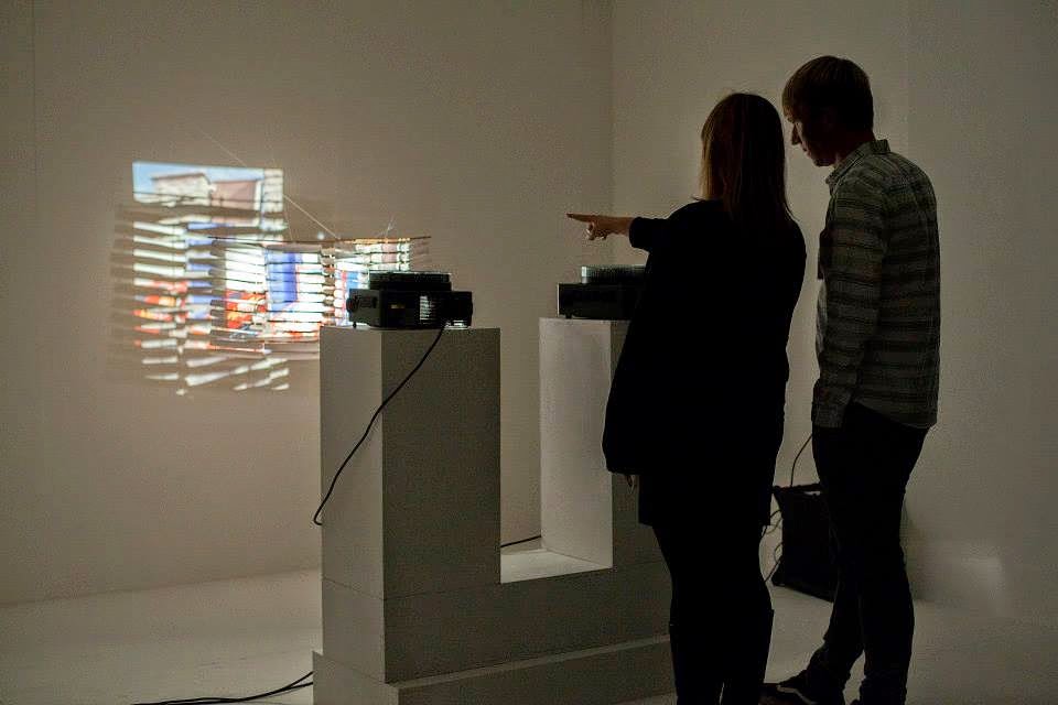
Punch and Judy Show (edge of representation) is a new time-based installation piece I completed for the Bournemouth Emerging Arts Fringe as part of this years Arts by the Sea Festival. The work, which was shown at LUNG gallery on the 1st October, explores the conflict between systems of ordering and control, which Henri Lefebvre describes as ‘representations of space’, and visual representations of Bournemouth as ‘representational spaces’. 'Representations of space' are described as the maps, plans and strategies of urban planners and social engineers for controlling the way spaces are used and the people who use them, while ‘representational spaces’ are partly imagined, exist in the realm of the symbolic, and can represent of our hopes, dreams and identities. The work also seeks to embody the paradox of commercialised leisure: that however hard we try to escape the constraints of society and self, and predictability of everyday life, our attempts will always be thwarted by the organising systems and taken-for-granted typifications, which structure that which Zygmunt Bauman terms our 'life-world'; leaving us feeling disappointed and trapped. Moreover, the sense of subjective freedom we attain through everyday escape attempts, encompassing our ability to re-imagine and transform our surroundings, are also under threat from the tendancy to make our visual and discursive representations fall in line with a concensus or that which sociologist Erving Goffman refers to as ‘paramount reality'.
The
piece is centred on two automated 35mm slide carousel projectors, set
slightly out of synch to suggest a clash or conflict of ideologies.
One carousel contains images of systems of ordering and control –
diversionary entertainments, maps, signs and information boards, CCTV
cameras and penalty warnings – and on the other houses visual
representations of Bournemouth as a heterotopia
of touristic
possibilities – moments of heightened aestheticisation
and improvised narratives in the visual vernacular of Continental
tourist travel. The first set of images (utilitarian), are taken
using Fuji film and have a slightly cold, detached feel, and the
second (romantic) are shot in Kodak to give them a nostalgic glow.
The
de-synchonisation of the carousels leads to a new set of image
combinations after each full rotation. This lends the work the element of chance as the sequence works its
way through
all potential variables of image juxtaposition. This is a direct reference to the carnivaleque strategy of chance as means of
eliminating the sense of boredom, pre-determination and fate experienced
in everyday life. The
use of outmoded analog
equipment
with
its mechanical action, together
with these chance juxtapositions, also suggest
both the fragility of life and the vulnerability of the meaning in
the autobiographical images we store in the
image magazines in our
minds (our own machines of representation). These meanings are also
enriched by the use of screens made from razor shells: the discarded
husks of lives once lived. The
work is backed by a specially commissioned soundtrack, made
in collaboration with Bournemouth
hauntological music
duo Language
Timothy! This
uses stereophonic
sound design to produce a sense of location: both inducing
feelings of disorientation and augmenting the dualistic visual
onslaught with a immersive sound-scape to overwhelm the senses. The
soundtrack is
comprised of field
recordings from a local
amusement arcade, together with a range of samples, including a 1950s
instrumental version of Stranger in Paradise; a title which is
perhaps the best metaphor for the tourist
paradox.
Tuesday, 5 August 2014
Thoughts on painting and the mundane
We Found Place in a Hopeless Love
2013, acrylic on canvas, 51x41cm
The
problem with my paintings is that they appear to celebrate the very
thing that they are critiquing. There is an attempt within them to
explore the ambiguities, ambivalences and paradoxes of tourism and
yet they do this from within a picturesque and commercial form. The
source material is often in the form of photographs of places of
conspicuous consumption. These are then cropped to isolate and
emphasise details which explore particular concepts or
sensibilities. In this sense they are using an aesthetic form to
emphasise ontological perspectives. This is problematic within the
institutional framework of fine art because it does not represent a
paradigm shift. And while postmodernity appeared to put an end to the
avant garde, in reality, it operated within an entirely modernist
model. Likewise, subversive art movements like Dada and Situationism
were formed in response to the art canon and the avant garde, and
thus had no choice but to avoid radical modernist agendas and the
political, and retreat to the mundane. Pop Art was perhaps the first
truly postmodern art movement as it operated not in response but in
sympathy to that which it was critiquing. It revelled in artifice,
the banal and the everyday. Pop Art was not subversive in the
conventional sense. To subvert something is to acknowledge its
existence, to recognise it as a problem. Pop Art saw no problem with
the relationship between art and commerce, objects and capital.
Pop Art epitomises the sensibility of camp or that which revels in artifice and illusion. Sontag (1964) makes the point that camp is apolitical and anti-ideological. It is a sensibility that operates outside the system. It is fragile, illusive, mundane, and contingent and vulnerable in its meanings. For a 'sensibility which can be crammed into the mold of a system, or handled with the rough tools of proof, is no longer a sensibility at all' (Sontag, 1964). In this sense, camp is what Michel de Certeau (1991) terms a 'tactic': a mundane practice by which we can fly under the radar of ideological oppression. Camp is a Foucauldian semiotic 'event' (Badiou, 1988): an emergent form which has the power to subvert the established symbolic order and to generate a transfigured and luminescent 'Being' (Heidegger, 1964).
Returning to my paintings, the thing that stands out is that they are pop, without being camp. They have an mute seriousness, denoting feelings like alienation, detachment, melancholy and loss but they do this in way that is not overt or laid on thick. In fact, the images avoid weight of meaning as much as they do weight of paint. There is little gesture in the rendering of these feelings. They rely entirely on the source image for meaning and yet amplify in a way that is so subtle as to remain unnoticed by the impartial gaze. So if they are not camp or subversive, then what are they? If they are simply commercial art objects, then why is such care taken in maintaining their illusive meaning?
One answer is in the term care. The paintings are material manifestions of ontological practices of dwelling – in place, in images or representaions and in the work. For Heidegger, dwelling in objects is about concern or 'taking care' (Heidegger, 1964). This involves investment in both the images and the process of painting. Moreover, I also strive to embody phenomenological or ‘anti-aesthetic’ approaches to understanding visual representation in my paintings. Developing the notion of the liminal tourist moment (Hom Cary, 2004) I have tried to represent this in the following diagram as an ‘experiential learning cycle’ (Kolb, 1984) in relation to my own art practice:
Another
answer, is that there is a deliberate attempt to be commercial in
these images and in the domestic scale of my paintings in order to
communicate with the intended audience. In other words, they use an
aesthetic form in order to open up a dialogue with that audience. The
artist-led projects that I have generated as part of my research have
intentionally exposed and explored the tension between artist ego and
social reality. Within academia and the art market, there fundamental
need to perpetuate the myth of modernism and the avant garde. Indeed,
it is this process which legitimises the art world. This has
perpetuated a particular kind of gaze, which looks for the
authentically inauthentic: postmodern forms that fake the fact that
they are faking it. These forms appear to have a parodic sensibility
not dissimilar to camp but when interrogated always appear as an
authentic drive towards difference when they are in fact simply
producing allegory or text doubling another. A good example of this
Damien Hirst's For
the Love of God
(2007). Here the notion of authenticity masks the allegorical
banality of the object. We understand it through the relationship
between the cliché of the skull as a symbol of mortality and
diamonds doubling for eternity or the quest for immortality through
our relationship with capital, status and power. These are simple
metaphors masquerading as fundamental and authentic human meaning.
Death in art is like pressing the atomic button, it is going nuclear!
Would Géricault's
The
Raft of the Medusa
(1818-1819) have the same impact if the figures were casually fishing
over the side?
Likewise, would Warhol's car crash series elicit the sense of unease
and voyeuristic ambivalence in the viewer if the people in the images
were exchanging insurance details?
This argument may appear glib, however the point here is the most difficult art is no longer that of the avant garde but in forms which insinuate themselves upon that which has gone before. The picturesque is particularly problematic because it is the form of commercial representation and amateur art; both of which borrow their visual vernacular from redundant art movements. The visual traditions of landscape painting served either to emphasise ownership, wealth and power or the desire to retrieve some fictive authentic past. Only perhaps do Turner's depictions of the romantic sublime reject these motivations. Indeed, what makes much of Turner's work so powerful is he does this within the institutional framework and vernacular of the form. In other words, he is not rejecting what has gone before but inverting it from within.
To make work that uses the vernacular of the avant guard to comment on the mundane may appear brave but to explore the mundane from within a mundane visual form is, perhaps, more interesting. Lichenstein is not simply making comic books but is reproducing the world with all its mute pathos. He is faking it without faking the fact that he was faking it. Like a Shangri-Las record, he uses mutability and camp to emphasise a different kind of authenticity: a relational authenticity of something which speaks to the everyday audience and is part of the mundane world. They are the shared images of Instagram, the derided “arty” tactics by which we communcate mundane meanings and values, they are not high art forms but instead a situated art practice. This involves the everyday engagement with image making, by which we restore Being through dwelling. My paintings belong to the everyday world, they come from and return to that world. In this sense my paints produce a relational aesthetics (Bourriaud, 2002). Moreover, the context for the work is the context of the work: a world connecting the everyday to tourism. A world that exists in representation with all its ambiguities, ambivalences and paradoxes in tact.
Labels:
aethetics,
ambivalence,
artifice,
bordom,
commerce,
dwelling,
liminality,
mimises,
mundane,
neutrality,
objects,
painting,
photography,
popart,
representation,
theavantguard,
tourism,
touristobjects,
touristpaintings
Subscribe to:
Posts (Atom)
.bmp)